Brand
Helix brand assets
The marks, web and app icons, colour families, and typefaces that make up the Helix identity, with click-to-copy hex values and downloadable assets.
Primary mark
Icon
The double-helix glyph. Three variants: full color (default), white (reverse), and black (light surfaces).


Primary mark
Wordmark
Mark + the Iceland wordmark, locked at logo 0.75× wordmark height with gap 0 and letter-spacing 0em. Use this lockup wherever Helix appears alongside other brands.
Color · dark bg
Mark + Iceland wordmark, gradient on dark. Default for product/marketing.

Web & app icons
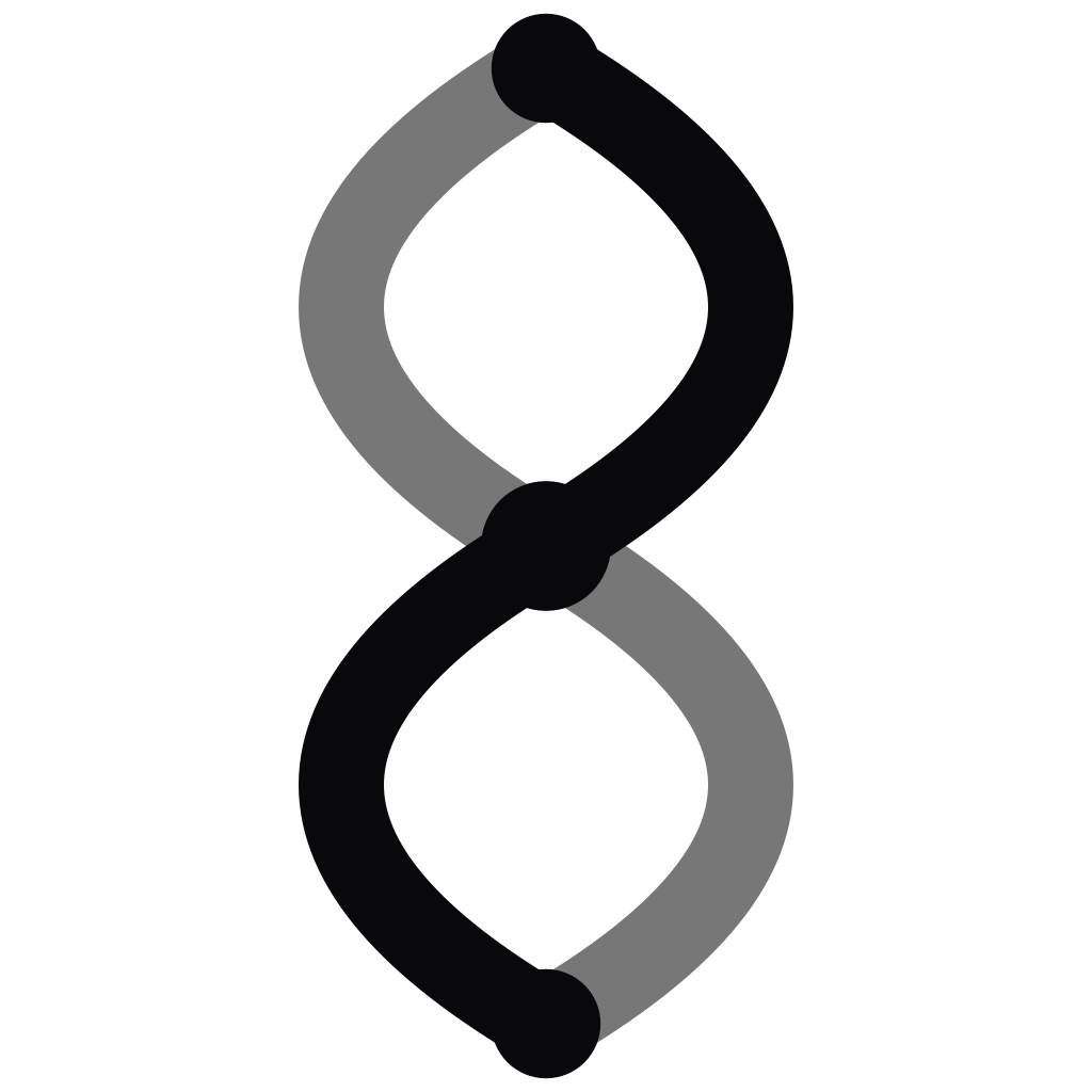
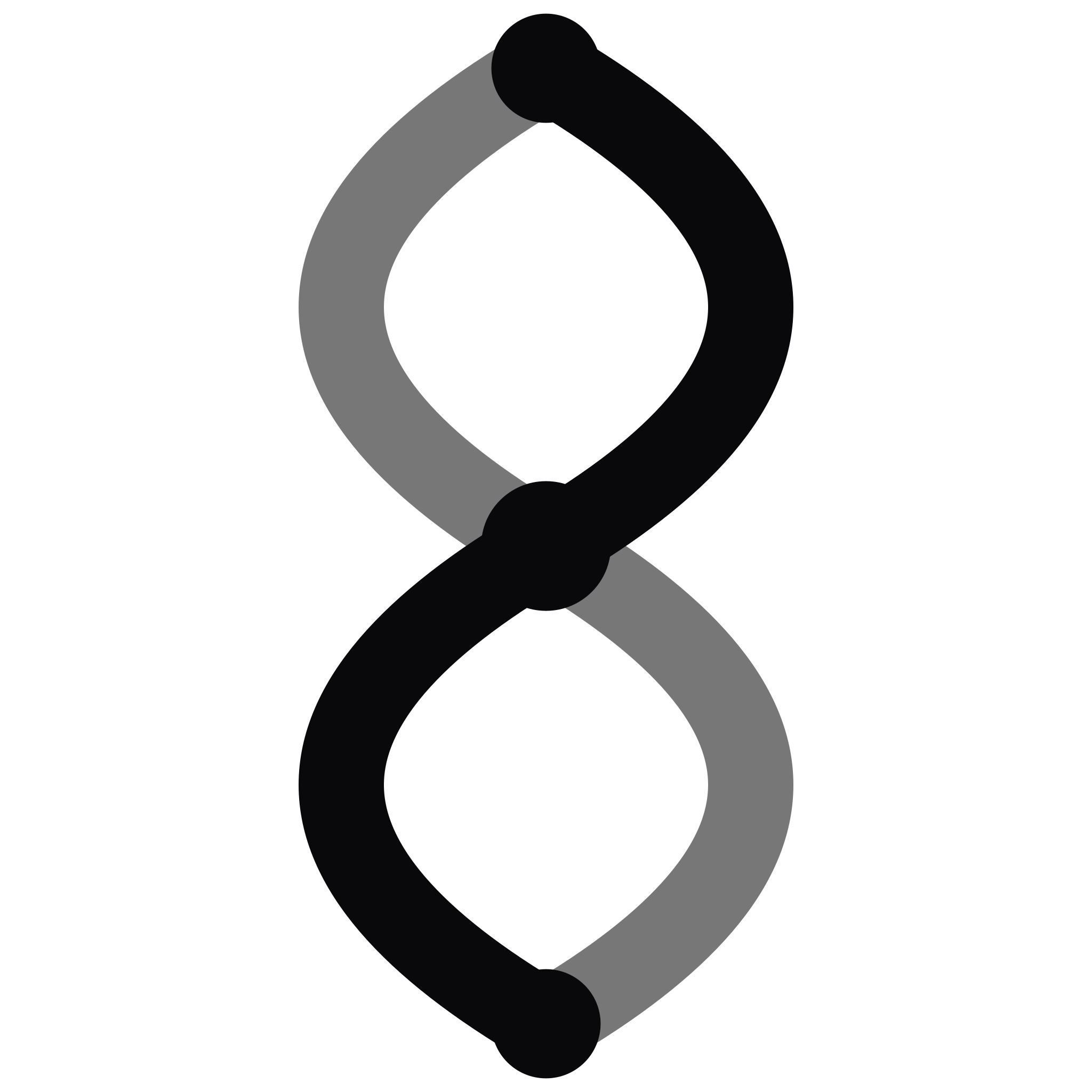
Technical icon exports, shown honestly. Every icon at or below 96×96 renders at its actual pixel size and is never enlarged, so the preview shows the real rendering quality at the size that matters. All files source from the canonical public/brand/favicon and public/brand/app-icons directories.
Web (favicon)


App icons






Colour
Charcoal primary + Helix-mark emerald accent on a near-pure-white canvas for marketing surfaces. Portal stays on the dark canvas for operators. Click any swatch to copy its hex.
Brand
Marketing surfaces (light)
Portal surfaces (dark)
Pills
Semantic pill families with paired background, text, and border tokens. Use only these five for pill-style status chips and category tags across the portal.
| Family | Preview | Background | Text | Border |
|---|---|---|---|---|
Purple | community | bg-purple-100 #F3E8FF | text-purple-700 #7E22CE | border-purple-200 #E9D5FF |
Blue | in review | bg-blue-100 #DBEAFE | text-blue-700 #1D4ED8 | border-blue-200 #BFDBFE |
Pink | connected | bg-pink-100 #FCE7F3 | text-pink-700 #BE185D | border-pink-200 #FBCFE8 |
Teal | active | bg-teal-100 #CCFBF1 | text-teal-700 #0F766E | border-teal-200 #99F6E4 |
Yellow | attention | bg-yellow-100 #FEF9C3 | text-yellow-700 #A16207 | border-yellow-200 #FEF08A |
Grade ramp
Semantic A-to-F coloring on audit + scorecard surfaces. Conventional green-to-red so a prospect reads good vs bad at a glance.
A
#10B981
tw emerald-500
B
#84CC16
tw lime-500
C
#F59E0B
tw amber-500
D
#F97316
tw orange-500
F
#E11D48
tw rose-600
Hero heading gradient
Reserved for hero titles and top-of-page section headers ONLY. Charcoal at the ends, emerald through the middle so the sentence hands off from the serious brand primary to the mark color and back. Do not use on body copy, buttons, chips, or subheadings.
Example
Be cited by the AI models your buyers ask.
CSS
background: linear-gradient(
  90deg,
  #18181b,  /* charcoal */
  #3f3f46,  /* charcoal soft */
  #10b981,  /* Helix emerald */
  #059669,  /* emerald deep */
  #18181b   /* charcoal */
);
background-size: 200% auto;
-webkit-background-clip: text;
-webkit-text-fill-color: transparent;
background-clip: text;
Marketing-light theme only. On the dark portal canvas the gradient inverts to a lighter charcoal so it stays legible; portal hero headings should prefer solid white anyway. Not animated by default; the earlier text-shimmer animation was retired 2026-07-02.
Typography
Two families do all the work: Iceland sets the wordmark, Geist runs everything else, and Geist Mono handles code and labels. The type scale lives on /design.
Display / wordmark
Helix
Iceland · Regular 400
Used only for the wordmark lockup. Never for body or UI.
Body & UI
The quick brown fox
jumps over the lazy dog · 0123456789
Geist · 400 / 500 / 600 / 700
Default for every heading, body, and UI role.
Code & labels
helix_entities
#10B981 · run_id 0123456789
Geist Mono · 400 / 500
Code, hex values, run IDs, and mono labels.
Usage
The locked rules for putting Helix in the wild.
✓ Do
- Prefer SVG. Use the SVG files everywhere they render. PNG only for environments that cannot consume vector.
- Respect clearspace. Leave at least one mark-glyph height of clear space around the wordmark on every side.
- Use the locked lockup. Iceland all-caps · logo 0.75× wordmark height · gap 0 · letter-spacing 0em. Don’t re-typeset.
- Match contrast. Color variant on neutral or branded backgrounds; mono variants on photography or print.
✗ Don't
- Don’t recolor the gradient. The emerald → lime gradient is fixed. Use the mono Black or White marks if you need a single color.
- Don’t stretch or skew. Scale the asset uniformly. No rotation, drop shadow, outline, or warp.
- Don’t reset the typeface. Iceland is the wordmark. Don’t pair the mark with another typeface and call it Helix.
- Don’t crop the mark. The double-helix curves are the mark. Don’t use a partial silhouette.
Questions about brand use?
For partnerships, press, or anything else not covered here, drop us a line first.
hello@getlatest.ai